Tips and Tricks
Here ia a subtitle that you can enter in the post options.
Welcome to our comprehensive guide on customizing and enhancing your MONO theme for Publii CMS. This article provides practical tips and easy-to-follow instructions for elevating your website's aesthetics and functionality.
1. Adding Icons to Menu using the Feather Icons Plugin
To add icons to your menu in the MONO theme, you need to install and enable the Feather Icons plugin. This plugin can be found at the Publii Marketplace: Feather Icons Plugin.
Steps to Add Icons to the Menu:
- Install the Plugin: First, download and install the Feather Icons plugin from the Publii Marketplace.
- Enable the Plugin: Ensure the plugin is activated in your Publii CMS after installation.
- Add Icons to Menu Items: When creating menu items, specify the icon by using a shortcode in the "Link Title Attribute" field. The format for the shortcode is
. To find the names of available icons, refer to the documentation provided with the Feather Icons plugin.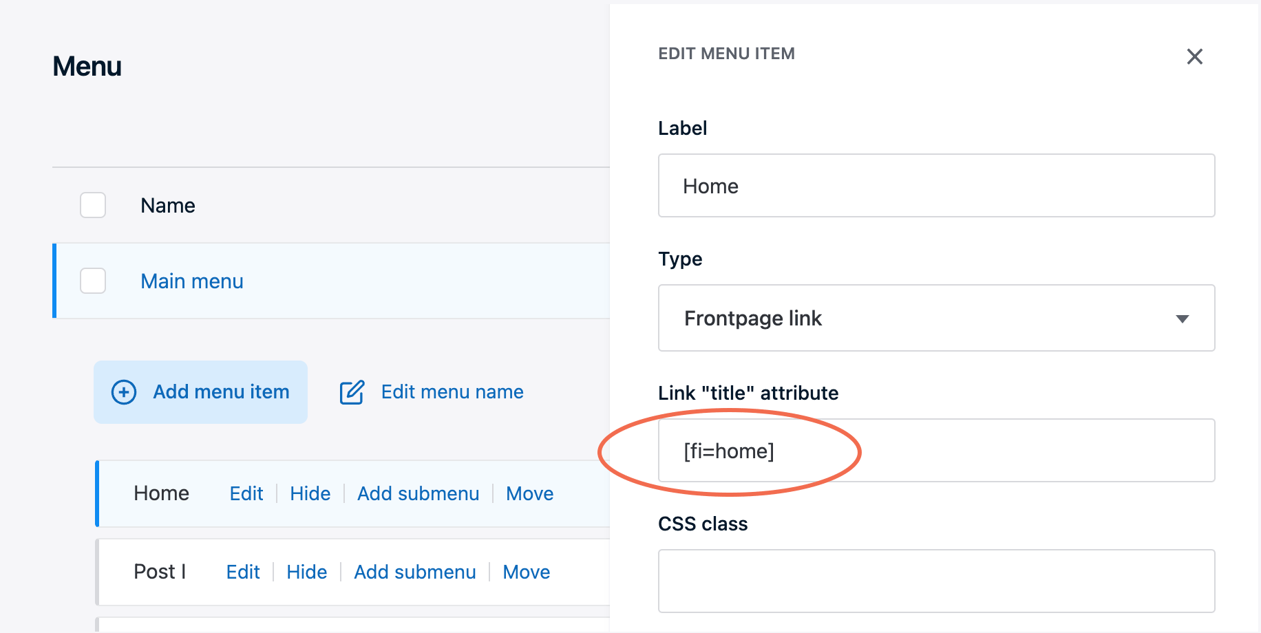
2. Styling the Social Sharing Plugin to Match Theme Buttons
If you want to use the social sharing plugin and style it to match the built-in share buttons of the MONO theme, follow these steps:
Steps to Style Social Sharing Buttons:
- Configure Display Mode: In the plugin's options, set the Display Mode to "Both Icon and Text". This ensures that each social sharing button displays the icon and text.
- Add Custom CSS Class: In the Advanced Options section of the plugin, you'll find a field for "Button CSS Class". Add the following classes alongside existing classes:
tltp tltp--top. These classes will apply the tooltip style, positioning the tooltip above the button and ensuring consistency with the theme's design.
3. Styling the Follow Plugin to Match Theme Buttons
To ensure the Follow Plugin integrates seamlessly with the MONO theme, you'll use a similar approach for the Social Sharing Plugin, with an extra step to adjust the Target Container Class.
Steps to Style Follow Plugin Buttons:
- Configure Display Mode: Like with the Social Sharing Plugin, set the Display Mode of the Follow Plugin to "Both Icon and Text". This will display both the icon and the text for each follow button.
- Specify Target Container Class: In addition to the above steps, you must change the Target Container Class to ensure the follow buttons are placed correctly within your theme layout. In the Follow Plugin's settings, find the field for "Target Container Class" and change its value from the default
footer__socialtofollow. This alteration ensures that the follow buttons are displayed in the desired location and match your theme's styling. - Add Custom CSS Class: In the Follow Plugin Advanced Options section, locate the "Button CSS Class" field. Add the same classes as you did for the Social Sharing Plugin:
tltp tltp--top. These classes apply the tooltip style and position the tooltip above the button, maintaining consistency with the theme's design.