How a story finds its pictures
A few deliberate choices give words and photographs enough space to work together.
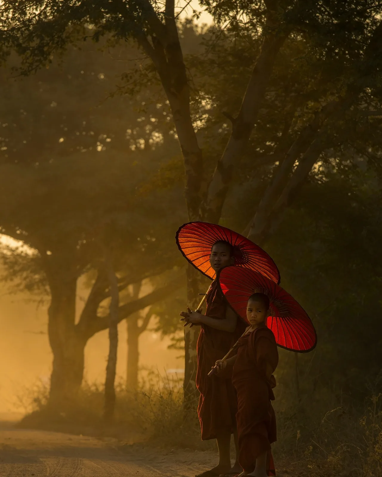
The first image usually sets the scale of a story. An open landscape asks the reader to look outward; a portrait brings the attention closer. In this journal, the photograph at the beginning is chosen for the subject of the piece, not simply because it fills the available space.
The images that follow have other jobs. They may introduce a detail, change the distance or give the reader a pause between sections. Repeating the opening photograph rarely adds much. A related view can take the story somewhere new.
Give each photograph a reason to stay
Lay the pictures out before deciding how many to use. If two frames say almost the same thing, choose the one that carries the idea more clearly. A short sequence with distinct views often feels more complete than a long set of near-duplicates.
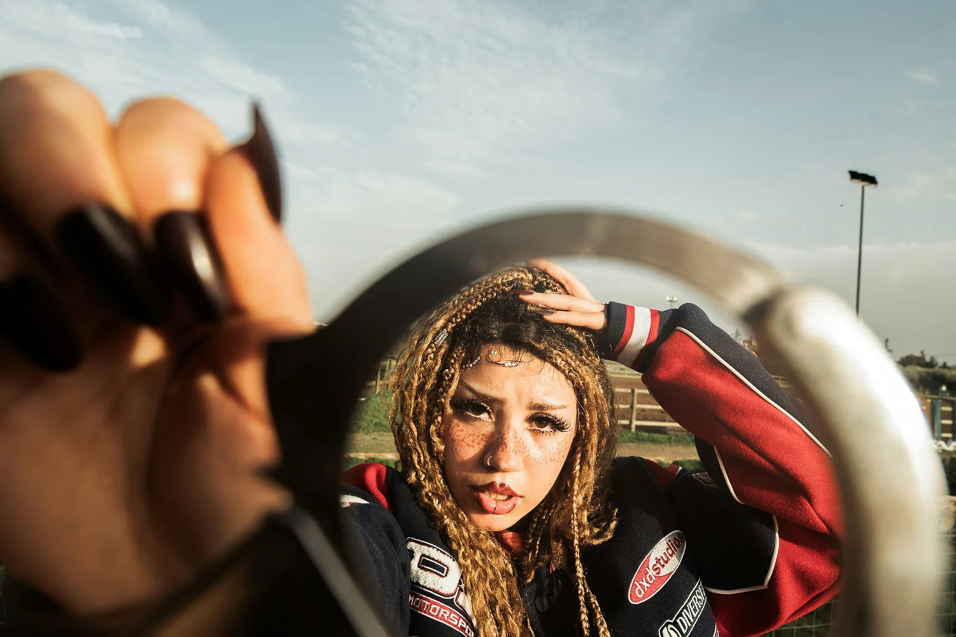
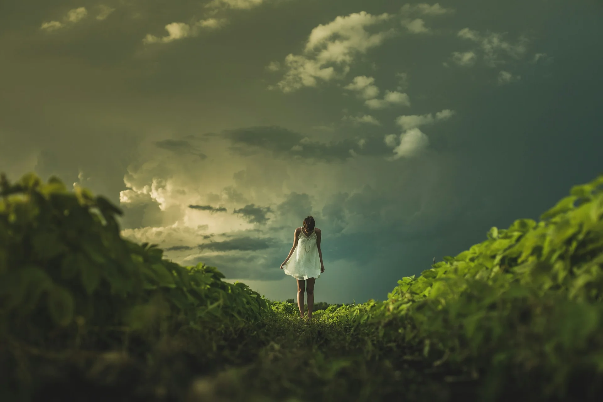
A gallery works when the relationship between the images matters. It allows a reader to compare them without a paragraph interrupting every frame. For a photograph that needs a little more explanation, a single image beside the relevant section is usually easier to follow.
Keep the words useful
Captions should add something the reader can use: a place when it is known, a detail worth noticing or a brief explanation of the image's role. Attribution belongs with the photograph or in a clear credits record. It should never be invented from a filename.
Headings mark a change in the thought. Quotations deserve space when a sentence benefits from being considered on its own. Neither needs to appear at a fixed interval just to make the page look busy.
The final check is a simple read from beginning to end. Does each photograph arrive where it helps? Is there enough uninterrupted prose to develop the idea? If the arrangement is asking for more attention than the story, remove something and read it again.