Colour in the everyday
An orange wall and two red dresses make a brief arrangement on the street.
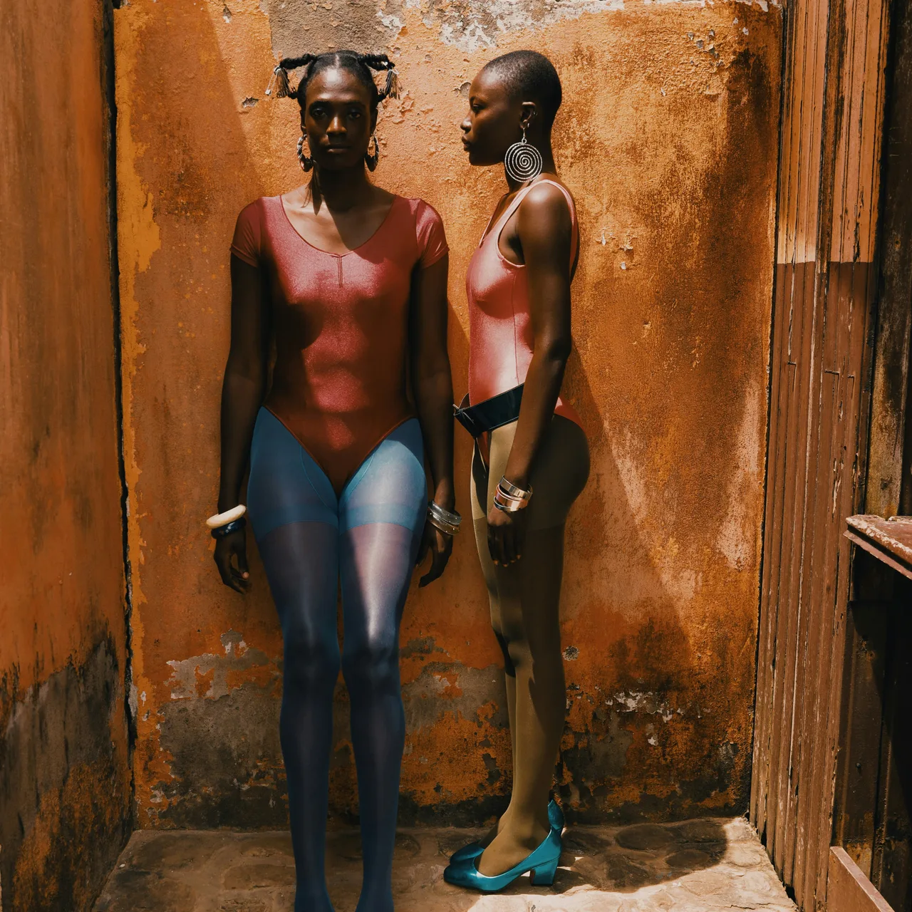
Colour sometimes arrives before the subject. You notice the orange wall, then the red clothing, and only afterwards begin to look at the people and their gestures. The photograph works because those things share a small space for a moment.
A strong background does not have to be elaborate. Plain painted surfaces are useful precisely because they give the eye fewer competing details. The texture can remain visible without becoming the main event.
Let the colours stay a little uneven
Real surfaces rarely match a tidy palette. Paint fades near the ground. Shade cools one edge of a wall. Fabric changes colour as it folds. Those variations give the scene depth, and heavy editing can remove them surprisingly quickly.
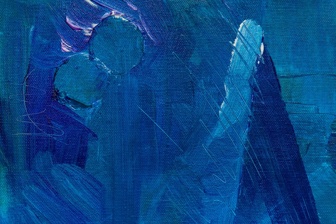
Compare the wall with the painted surface above. One has become part of a street; the other fills the frame with colour alone. In both, the marks matter. They tell us that the colour belongs to a material rather than to a perfectly flat block on a screen.
A good colour relationship can be found before it is designed.
You might begin a walk with a single colour in mind. Notice where it appears in small amounts: a bag, a window frame, a piece of lettering. There is no need to photograph every example. The exercise is simply a way to make familiar surroundings less automatic.
When two or three colours come together naturally, give the arrangement a little space. Include enough context for it to remain a street scene rather than an isolated swatch. A shadow, a gesture or a rough edge can keep a very graphic photograph connected to ordinary life.